Challenge
Compass Bible Church needed sermon series graphics that could do two things at once: feel visually current enough to capture attention, and hold together as a cohesive system across multiple distinct series throughout the year.
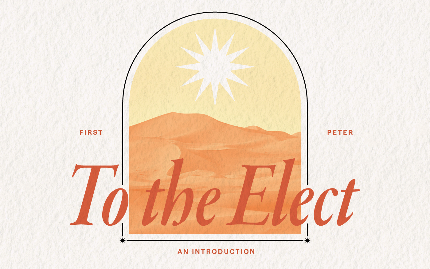
Approach
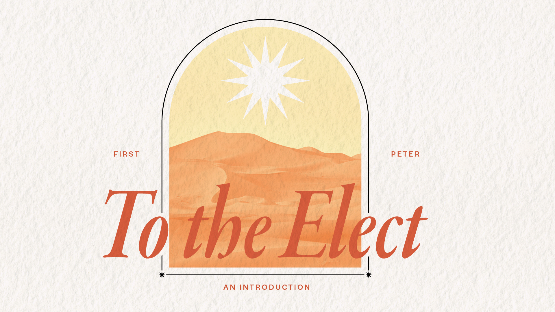
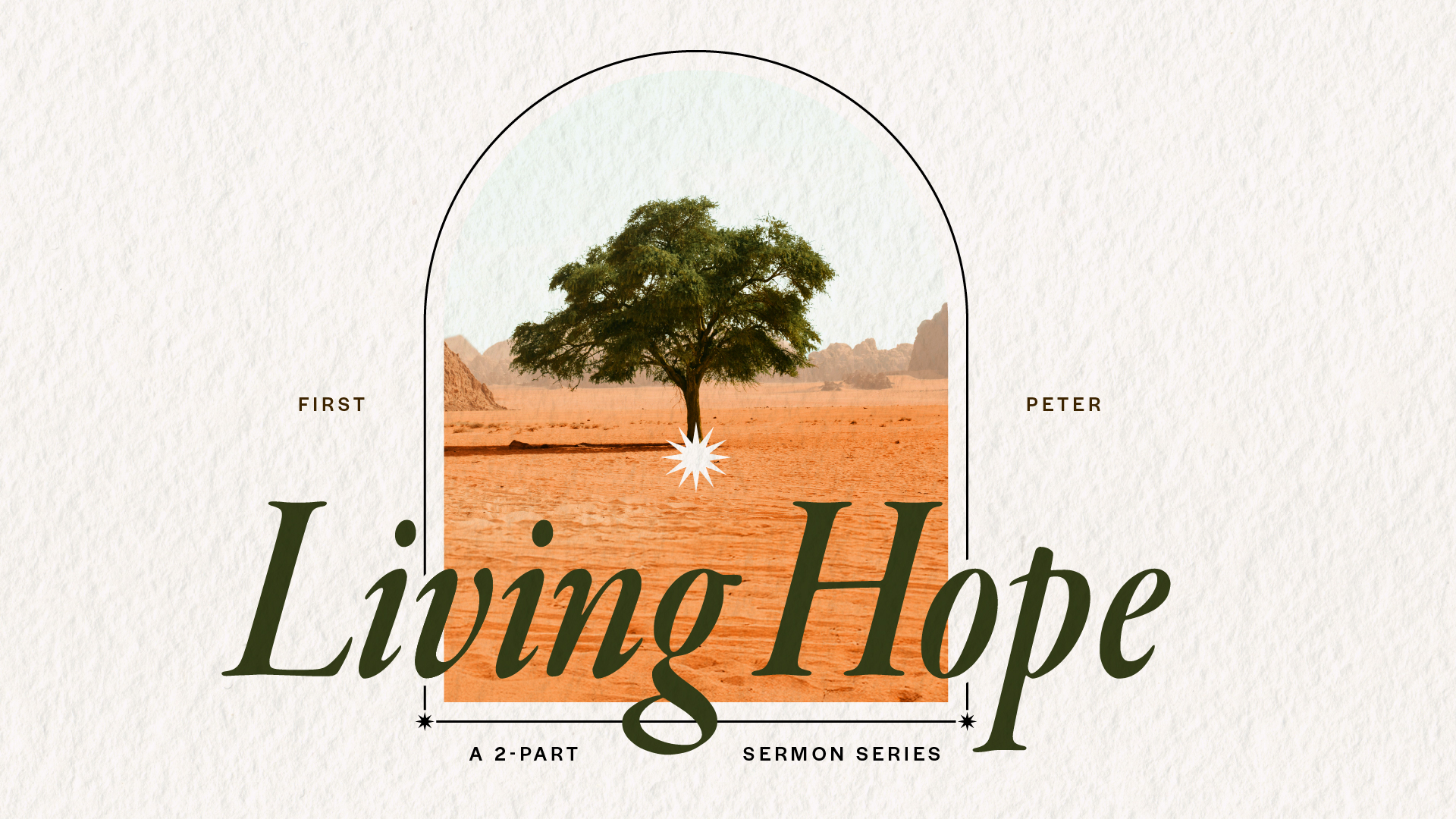
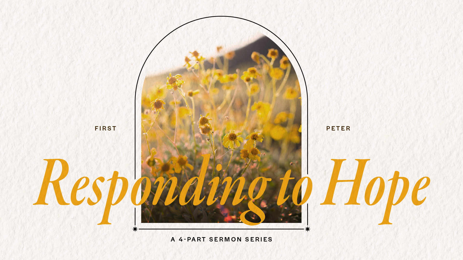
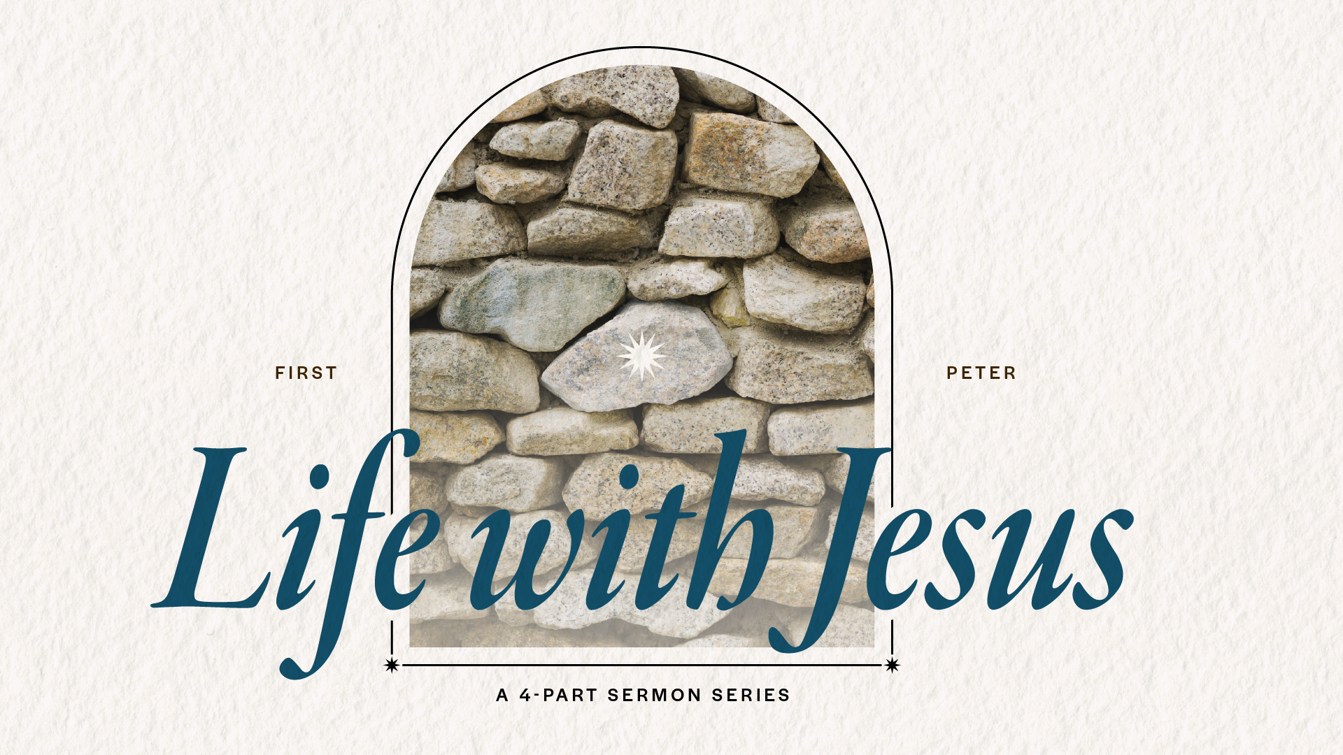
I developed a flexible design system built around a recurring architectural element: a rounded arch framing an illustrated central image paired with an oversized italic serif that breaks the frame. Each series gets its own image and color palette drawn directly from the text. For the opening 1 Peter series, the theme of exile shaped everything: a warm desert scene in burnt orange and gold, a blazing star overhead, and the title “To the Elect” running large enough to overlap the illustration. The structure stays consistent across series; the imagery and palette shift to match the content. I designed the full asset set for each series: presentation slides, social media graphics, and bulletin covers.