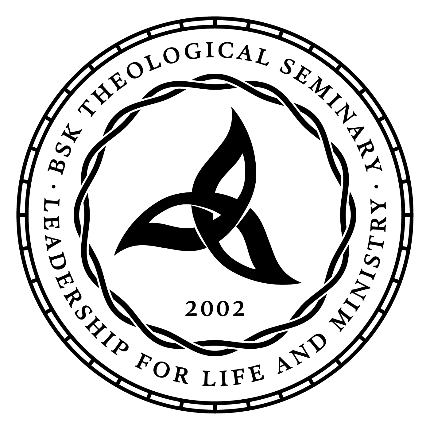
Challenge
Baptist Seminary of Kentucky needed a new logo to match their evolution as a progressive, ecumenical institution. Their existing mark was a traditional triquetra, and although historically resonant, it was visually dated. They wanted something that honored that heritage while feeling unmistakably contemporary.
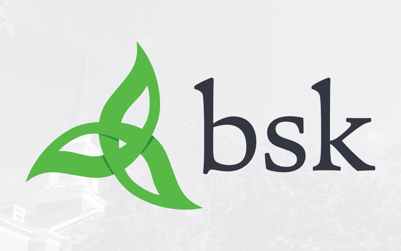
Approach
Rather than abandon the triquetra, I reworked it from the inside out. I took its central interlocking logic and evolved it into three flowing, leaf-like shapes with subtle shadows that preserve the sense of interconnection. The result feels organic, alive, and growing. I paired the mark with a serif typeface inspired by early manuscripts but with a contemporary sensibility, grounding the logo in BSK’s scholarly identity without making it feel archaic.